What is graphic design?
When I started my career as a graphic designer back in 1996, I had no idea where it would take me. Graphic design is a profession that takes the ideas of advertisers and clients and turns them into usable files for various types of printing or for building websites and online stores.
Graphic design is the ability to take all the materials provided by the client, such as text, images, logos, tables, graphics, and other content, and transform them into a final advertising product.
What is a graphic designer?
It’s a common misconception that graphic designers are also artists… it’s neither necessary nor essential. A graphic designer, first and foremost, must be familiar with the software they work with to the point where they can extract the maximum potential from it.
- You need to have a visual way of thinking, so you can construct the scene in your mind and know what you want to achieve… personally, this helps me a lot.
- You should understand proportions and when you’re making a collage, arrange the scene correctly. Utilise foreground and background, pay attention to the height and width of objects, and their natural ratios.
- You should be knowledgeable about shadows, so when you apply them, they fall naturally, the dark areas are precise, and they don’t bother the eye. This can help you determine whether a scene looks natural or assembled.
- To know the difference between vector and raster graphics is essential. As strange as it may sound, I’ve encountered designers who can’t distinguish between the two.
Adobe Illustrator and CorelDraw are vector programs. Yes, you can place images in them, but the text and other graphic elements created there are vectors, and you can manipulate them freely.
Adobe Photoshop and photo editing programs are for raster graphics – files that can only be manipulated within certain parameters, and you can’t make them three times larger, for example, because you’ll lose quality.
- Understanding color models like CMYK, RGB, PANTONE is also important. Why?
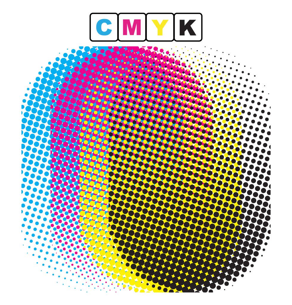
For printed materials, CMYK is used, which literally stands for Cyan, Magenta, Yellow, Black – these are the four primary colors used in printing. Every color in the end is separated into these four ink colors and printed that way.

For web design, RGB is used, which is a color model that cannot be used for printing because the results are disastrous when color separation occurs. I’ve witnessed it firsthand.
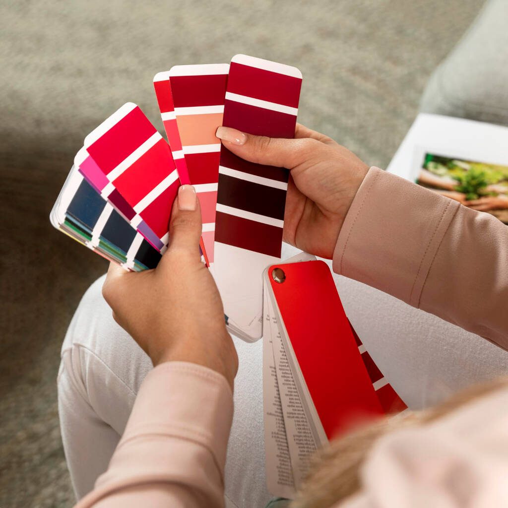
PANTONE is a color model used for offset, flexo, gravure, and screen printing. These are “solid” colors that can be used for logos, corporate branding, and printed materials, and you can be sure you’ll get consistent results.

In the preparation of a design for yogurt packaging or cheese box, the approach is different, and often, due to the nature of the printing, different colors are used to achieve a good end result. In this type of printing, up to 6 colors can be used. We have prepared packaging using only solid colors, using dark green/blue or red instead of black. We’ve overlaid different Pantone colors for maximum effect. To me, mastering these techniques is like reaching an advanced level in graphic design.
What is prepress preparation?
A graphic designer should have a good understanding of prepress preparation, which is the process of preparing your project for printing. Prepress preparation includes finishing processes such as trimming margins, collating, modifying the design for printing, adjusting colors by subtracting percentages of one color or adding another, overlaps, image inclusion, converting text and outlines to curves.
In practice, I have encountered each of the mentioned processes and their exceptions. It is best to consult with the printer who will be fulfilling the order.
Prepress preparation is performed according to the type of printing you will use – offset, flexo, screen printing, and so on. Each of them has its own specific requirements depending on color models and their combinations.
Offset printing uses the eye’s perception by overlaying dots of different sizes to recreate colors.
Flexo printing, depending on the material, does not allow dots to merge, and you should avoid overlaps. The raster is cut from 3% and up, and low values are lost.
In screen printing, color is only applied at 100%, and gradients are not allowed.
These are distinct characteristics that are learned through practice and by asking colleagues.
- Think ahead when designing – whether it’s for promotional materials or creating an online store, you need to know what’s coming to avoid mistakes.
- Finishing processes like die-cutting, creasing, spot varnishing, folding, and gluing also determine the appearance of the project you’re preparing.
- You can’t have an odd number of pages in a book or print in the glue area of a box.
- If you don’t know, ask – speak to those with more experience. This way, you’ll get an ideal end product without needing multiple revisions.
What is web design?
Web design is intended for the preparation of promotional materials, banners, slides, website design, and online stores.
In this type of graphic design, you work in the RGB color model, with the goal of making the final product as lightweight and understandable as possible.
- You should be familiar with the requirements of various advertising platforms such as Google Ads, Facebook, Twitter, Tik Tok, and others.
- You should create files that are as lightweight and fast-loading as possible.
- You should be knowledgeable about file formats like JPG, PNG, Webp, SVG, and know when and why to use each of them, including which ones have transparency.
- You should be able to prepare different versions of a website for various devices – desktop and mobile – in order to maintain the appearance and functionality.
The result
Everything I’ve listed so far is to show and explain why we don’t just create images, but each of our steps is part of a technological process aimed at ensuring that you… our customers, remain satisfied.


